1. in what ways does your media product use, develop or challenge forms and conventions of real media products?
Before starting my mock I researched indie magazines like NME and Q magazine which my brother buys every week. This helped me pick my target age as before I researched the magazines I was going to have a starting age at seventeen but as my brother is fourteen and reads NME week in week out so I changed my target audience to fourteen to twenty four year olds as I feel that there is an audience for my magazine, even at the age of fourteen but then i reviewed this die and found out the majority of fourteen year olds do not read music magazine like NME and Q just a select few so i changed my target audience back to my original audience which was seventeen year olds to twenty four year olds. The masthead going across the top left hand side of the page is bold and in blocked capital letters the catch the reader’s attention this is similar to the font used by NME for their masthead. It is a masculine font, which I used because my magazine is targeted at more of a male audience. My model is wearing smart clothing making him look like a successful artist which appeals to my target audience.
Mast head-I used a large black and white masthead as it suited my cover as i stuck to a black and white look from my models clothing to the writing filling the page.
Cover lines- i put the cover lines on the left of the page underneath the masthead as the masthead will catch the audience attention and they will instantly look down towards the cover lines.
Sky line- This is used by most music magazines it attracts the sort of audience my magazines appeals to aswell as being about 'the greatest 10 frontmen of all time' which is relevant as my model as posing as a frontman.
Main feature- My main feature is situated underneath the masthead and the words 'BURNHAM' and 'THE COMEBACK' are written in large, bold font standing out to the reader. It is written to the left hand side of my artist so the reader knows who 'BURNHAM' is.
I used a mixture of the blocked writing used by NME and the boxed effect used by Q magazine to design a masthead for my magazine.
I got my idea of my artist wearing smart clothing from looking at Esquire covers and in particular Robert Downey Jnr's cover.
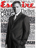
I was also inspired to do my front cover black and white from a Esquire cover of Daniel Craig but without the bright masthead.
The cover lines are the same on most music magazines, i used a variety of different fonts and sizes but kept the same black and white look.
Layout Conventions:
The layout i used was based on how Q magazine laid out there Jay Z front cover. I have a sky line going across the top saying 'The 10 greatest frontmen of all time' and Q used one that said 'The 10 most exciting people in music now'. Both Q's and my masthead is in the top left corner to catch the audiences attention instantly. Underneath the masthead are cover lines going to the bottom of the page, ine is in black and white where as Q's is a mixture of different colours. My image of my artist takes up the right side of the page, Q's takes up mainly the right side of the page.


No comments:
Post a Comment